
What is CSS Float?


With CSS float, an element can be pushed to the left or right, allowing other elements to wrap around it.
Float is very often used for images, but it is also useful when working with layouts.
How Elements Float
Elements are floated horizontally, this means that an element can only be floated left or right, not up or down.
A floated element will move as far to the left or right as it can. Usually this means all the way to the left or right of the containing element.
The elements after the floating element will flow around it.
The elements before the floating element will not be affected.
If an image is floated to the right, a following text flows around it, to the left:
Example
<html>
<head>
<style type="text/css">
img
{
float:right;
}
</style>
</head>
<body>
<p>In the paragraph below, we have added an image with style <b>float:right</b>. The result is that the image will float to the right in the paragraph.</p>
<p>
<img src="logocss.gif" width="95" height="84" />
This is some text. This is some text. This is some text.
This is some text. This is some text. This is some text.
This is some text. This is some text. This is some text.
This is some text. This is some text. This is some text.
This is some text. This is some text. This is some text.
This is some text. This is some text. This is some text.
This is some text. This is some text. This is some text.
This is some text. This is some text. This is some text.
This is some text. This is some text. This is some text.
This is some text. This is some text. This is some text.
</p>
</body>
</html>
Try it yourself in Notepad or Dreamweaver by coping and pasting the code above.
In the paragraph below, we have added an image with style float:right. The result is that the image will float to the right in the paragraph.

This is some text. This is some text. This is some text. This is some text. This is some text. This is some text. This is some text. This is some text. This is some text. This is some text. This is some text. This is some text. This is some text. This is some text. This is some text. This is some text. This is some text. This is some text. This is some text. This is some text. This is some text. This is some text. This is some text. This is some text. This is some text. This is some text. This is some text. This is some text. This is some text. This is some text.
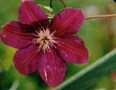
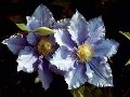
Floating Elements Next to Each Other
If you place several floating elements after each other, they will float next to each other if there is room.
Here we have made an image gallery using the float property:
Example
<html>
<head>
<style type="text/css">
.thumbnail
{
float:left;
width:110px;
height:90px;
margin:5px;
}
</style>
</head>
<body>
<h3>Image Gallery</h3>
<p>Try resizing the window to see what happens when the images does not have enough room.</p>
<img class="thumbnail" src="klematis_small.jpg" width="107" height="90">
<img class="thumbnail" src="klematis2_small.jpg" width="107" height="80">
<img class="thumbnail" src="klematis3_small.jpg" width="116" height="90">
<img class="thumbnail" src="klematis4_small.jpg" width="120" height="90">
<img class="thumbnail" src="klematis_small.jpg" width="107" height="90">
<img class="thumbnail" src="klematis2_small.jpg" width="107" height="80">
<img class="thumbnail" src="klematis3_small.jpg" width="116" height="90">
<img class="thumbnail" src="klematis4_small.jpg" width="120" height="90">
</body>
</html>
Try it yourself in Notepad or Dreamweaver by coping and pasting the code above.
Image Gallery
Try resizing the window to see what happens when the images does not have enough room.Turning off Float - Using Clear
Elements after the floating element will flow around it. To avoid this, use the clear property.
The clear property specifies which sides of an element other floating elements are not allowed.
Add a text line into the image gallery, using the clear property:
Example
<html>
<head>
<style type="text/css">
.thumbnail
{
float:left;
width:110px;
height:90px;
margin:5px;
}
.text_line
{
clear:both;
margin-bottom:2px;
}
</style>
</head>
<body>
<h3>Image Gallery</h3>
<p>Try resizing the window to see what happens when the images does not have enough room.</p>
<img class="thumbnail" src="klematis_small.jpg" width="107" height="90">
<img class="thumbnail" src="klematis2_small.jpg" width="107" height="80">
<img class="thumbnail" src="klematis3_small.jpg" width="116" height="90">
<img class="thumbnail" src="klematis4_small.jpg" width="120" height="90">
<h3 class="text_line">Second row</h3>
<img class="thumbnail" src="klematis_small.jpg" width="107" height="90">
<img class="thumbnail" src="klematis2_small.jpg" width="107" height="80">
<img class="thumbnail" src="klematis3_small.jpg" width="116" height="90">
<img class="thumbnail" src="klematis4_small.jpg" width="120" height="90">
</body>
</html>
Try it yourself in Notepad or Dreamweaver by coping and pasting the code above.
Image Gallery
Try resizing the window to see what happens when the images does not have enough room.Second row
More Example
An image with border and margins that floats to the right in a paragraph
Let an image float to the right in a paragraph. Add border and margins to the image.
Let an image float to the right in a paragraph. Add border and margins to the image.
<html>
<head>
<style type="text/css">
img
{
float:right;
border:1px dotted black;
margin:0px 0px 15px 20px;
}
</style>
</head>
<body>
<p>
In the paragraph below, the image will float to the right. A dotted black border is added to the image.
We have also added margins to the image to push the text away from the image:
0 px margin on the top and right side, 15 px margin on the bottom, and 20 px margin on the left side of the image.
</p>
<p>
<img src="logocss.gif" width="95" height="84" />
This is some text. This is some text. This is some text.
This is some text. This is some text. This is some text.
This is some text. This is some text. This is some text.
This is some text. This is some text. This is some text.
This is some text. This is some text. This is some text.
This is some text. This is some text. This is some text.
This is some text. This is some text. This is some text.
This is some text. This is some text. This is some text.
This is some text. This is some text. This is some text.
This is some text. This is some text. This is some text.
</p>
</body>
</html>
Try it yourself in Notepad or Dreamweaver by coping and pasting the code above.
Result:
In the paragraph below, the image will float to the right. A dotted black border is added to the image. We have also added margins to the image to push the text away from the image: 0 px margin on the top and right side, 15 px margin on the bottom, and 20 px margin on the left side of the image.
This is some text. This is some text. This is some text. This is some text. This is some text. This is some text. This is some text. This is some text. This is some text. This is some text. This is some text. This is some text. This is some text. This is some text. This is some text. This is some text. This is some text. This is some text. This is some text. This is some text. This is some text. This is some text. This is some text. This is some text. This is some text. This is some text. This is some text. This is some text. This is some text. This is some text.
An image with a caption that floats to the right
Let an image with a caption float to the right.
Let an image with a caption float to the right.
Example
<head>
<style type="text/css">
div
{
float:right;
width:120px;
margin:0 0 15px 20px;
padding:15px;
border:1px solid black;
text-align:center;
}
</style>
</head>
<body>
<div>
<img src="logocss.gif" width="95" height="84" /><br />
CSS is fun!
</div>
<p>
This is some text. This is some text. This is some text.
This is some text. This is some text. This is some text.
This is some text. This is some text. This is some text.
This is some text. This is some text. This is some text.
This is some text. This is some text. This is some text.
This is some text. This is some text. This is some text.
This is some text. This is some text. This is some text.
This is some text. This is some text. This is some text.
This is some text. This is some text. This is some text.
This is some text. This is some text. This is some text.
This is some text. This is some text. This is some text.
This is some text. This is some text. This is some text.
This is some text. This is some text. This is some text.
</p>
<p>
In the paragraph above, the div element is 120 pixels wide and it contains the image.
The div element will float to the right.
Margins are added to the div to push the text away from the div.
Borders and padding are added to the div to frame in the picture and the caption.
</p>
</body>
</html>
Try it yourself in Notepad or Dreamweaver by coping and pasting the code above.
Result:
CSS is fun!
In the paragraph above, the div element is 120 pixels wide and it contains the image. The div element will float to the right. Margins are added to the div to push the text away from the div. Borders and padding are added to the div to frame in the picture and the caption.
Let the first letter of a paragraph float to the left
Let the first letter of a paragraph float to the left and style the letter.
Let the first letter of a paragraph float to the left and style the letter.
Example
<head>
<style type="text/css">
span
{
float:left;
width:0.7em;
font-size:400%;
font-family:algerian,courier;
line-height:80%;
}
</style>
</head>
<body>
<p>
<span>T</span>his is some text.
This is some text. This is some text.
This is some text. This is some text. This is some text.
This is some text. This is some text. This is some text.
This is some text. This is some text. This is some text.
This is some text. This is some text. This is some text.
This is some text. This is some text. This is some text.
This is some text. This is some text. This is some text.
</p>
<p>
In the paragraph above, the first letter of the text is embedded in a span element.
The span element has a width that is 0.7 times the size of the current font.
The font-size of the span element is 400% (quite large) and the line-height is 80%.
The font of the letter in the span will be in "Algerian".
</p>
</body>
</html>
Try it yourself in Notepad or Dreamweaver by coping and pasting the code above.
Result:
his is some text. This is some text. This is some text. This is some text. This is some text. This is some text. This is some text. This is some text. This is some text. This is some text. This is some text. This is some text. This is some text. This is some text. This is some text. This is some text. This is some text. This is some text. This is some text. This is some text. This is some text.
In the paragraph above, the first letter of the text is embedded in a span element. The span element has a width that is 0.7 times the size of the current font. The font-size of the span element is 400% (quite large) and the line-height is 80%. The font of the letter in the span will be in "Algerian".
Creating a horizontal menu
Use float with a list of hyperlinks to create a horizontal menu.
Use float with a list of hyperlinks to create a horizontal menu.
Example
<head>
<style type="text/css">
ul
{
float:left;
width:100%;
padding:0;
margin:0;
list-style-type:none;
}
a
{
float:left;
width:6em;
text-decoration:none;
color:white;
background-color:purple;
padding:0.2em 0.6em;
border-right:1px solid white;
}
a:hover {background-color:#ff3300;}
li {display:inline;}
</style>
</head>
<body>
<ul>
<li><a href="#">Link one</a></li>
<li><a href="#">Link two</a></li>
<li><a href="#">Link three</a></li>
<li><a href="#">Link four</a></li>
</ul>
<p>
In the example above, we let the ul element and the a element float to the left.
The li elements will be displayed as inline elements (no line break before or after the element). This forces the list to be on one line.
The ul element has a width of 100% and each hyperlink in the list has a width of 6em (6 times the size of the current font).
We add some colors and borders to make it more fancy.
</p>
</body>
</html>
Try it yourself in Notepad or Dreamweaver by coping and pasting the code above.
Result:
In the example above, we let the ul element and the a element float to the left. The li elements will be displayed as inline elements (no line break before or after the element). This forces the list to be on one line. The ul element has a width of 100% and each hyperlink in the list has a width of 6em (6 times the size of the current font). We add some colors and borders to make it more fancy.
Creating a homepage without tables
Use float to create a homepage with a header, footer, left content and main content.
Use float to create a homepage with a header, footer, left content and main content.
Example
<head>
<style type="text/css">
div.container
{
width:100%;
margin:0px;
border:1px solid gray;
line-height:150%;
}
div.header,div.footer
{
padding:0.5em;
color:white;
background-color:gray;
clear:left;
}
h1.header
{
padding:0;
margin:0;
}
div.left
{
float:left;
width:160px;
margin:0;
padding:1em;
}
div.content
{
margin-left:190px;
border-left:1px solid gray;
padding:1em;
}
</style>
</head>
<body>
<div class="container">
<div class="header"><h1 class="header">Amaderit.com</h1></div>
<div class="left"><p>"Never increase, beyond what is necessary, the number of entities required to explain anything." William of Ockham (1285-1349)</p></div>
<div class="content">
<h2>Free Web Building Tutorials</h2>
<p>At W3Schools you will find all the Web-building tutorials you need,
from basic HTML and XHTML to advanced XML, XSL, Multimedia and WAP.</p>
<p>W3Schools - The Largest Web Developers Site On The Net!</p></div>
<div class="footer">Copyright 1999-2005 by Refsnes Data.</div>
</div>
</body>
</html>
Try it yourself in Notepad or Dreamweaver by coping and pasting the code above.
Result:
Amaderit.com
"Never increase, beyond what is necessary, the number of entities required to explain anything." William of Ockham (1285-1349)
Free Web Building Tutorials
At W3Schools you will find all the Web-building tutorials you need, from basic HTML and XHTML to advanced XML, XSL, Multimedia and WAP.W3Schools - The Largest Web Developers Site On The Net!
All CSS Float Properties
The number in the "CSS" column indicates in which CSS version the property is defined (CSS1 or CSS2).
| Property | Description | Values | CSS |
|---|---|---|---|
| clear | Specifies which sides of an element where other floating elements are not allowed | left right both none inherit | 1 |
| float | Specifies whether or not a box should float | left right none inherit | 1 |